
- Navigator
- Economic & Fiscal Impact Analysis
- Evaluation & Benchmarking
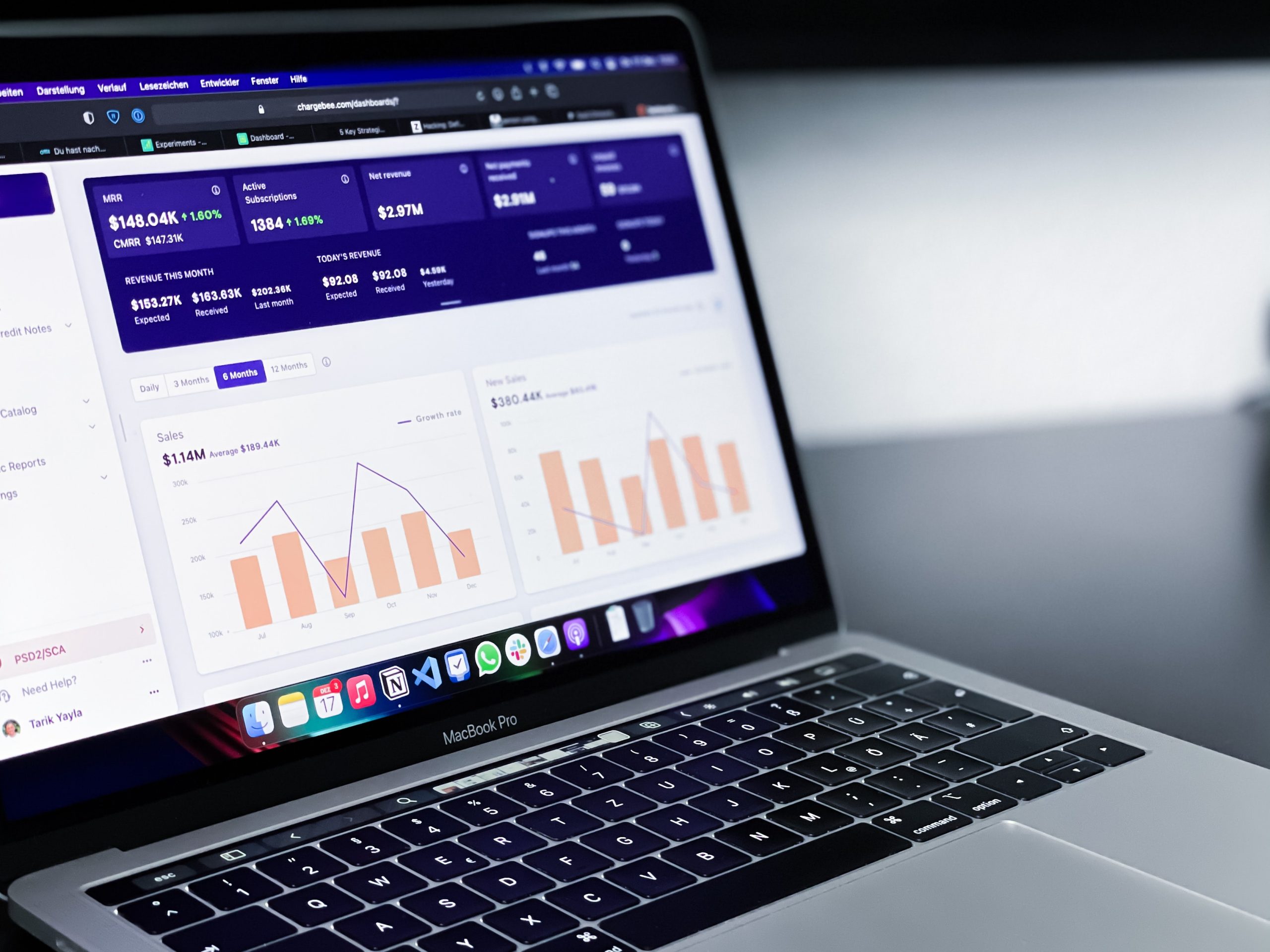 Would you rather read a 15-page report or play with an interactive economic impact dashboard? As long as all the information is the same, I wouldn’t blame you if you chose the interactive dashboard.
Over the years, Camoin Associates has discovered that, while a full report is still needed to provide the background information and methodology details (for all the data nerds out there!), you can more effectively tell your story with an economic impact dashboard.
An interactive dashboard has the same information as an economic impact report, but displays it in a way that may be more appealing and accessible for many people. A dashboard can be an effective format for sharing information for individual projects as well as for impacts over time as more data becomes available. It also allows the user to dive in deeper, if they want, and even download and share the results with others.
Opting to tell your story with an economic impact dashboard offers multiple benefits, including:
Dashboards are one of many tools Camoin Associates uses to help organizations more clearly define and promote their work. Examples include:
Whether you are looking to develop a user-friendly tool for your own internal use or to create a public-facing dashboard, this interactive format is the next step in putting critical data into the hands of decision makers, stakeholders, and constituents.

Workforce Development
What’s the best way to engage with young people in order to pique their interest in career opportunities in different sectors? Find out what a group of high school students recently told our author.

Industry Analytics
Economic & Fiscal Impact Analysis
Your resource for understanding today and looking toward tomorrow